
This guide introduces you to Run Results in Leapwork Performance. Run results show what happened during a performance test run so you can understand behaviour, spot bottlenecks, and decide what to investigate next.
What are Run results?
Run results are the detailed view of a completed or active load test. For every run, Leapwork Performance records:
-
How many virtual users were active over time
-
How response times behaved (including percentiles)
-
How many requests were sent and how many failed
-
How different assets (groups, sequences, or endpoints) performed
You typically:
-
Start a run from a Timeline.
-
Wait for it to complete or stop it manually.
-
Open the Run results to analyse what happened and confirm the test outcome.
The Run results workspace
If you’re new to Leapwork Performance, start with the Overview of the Performance workspace for a tour of the user interface.
When you open Run results, the workspace shows run‑specific information inside that same layout:
-
Run list: lists timelines that have been run, with status and duration.
-
Run header: shows the selected run, status, starting time, duration, and peak virtual users.
-
Timeline and VU chart: shows how virtual users and response times evolved during the run.
-
Metrics tables show detailed metrics for each asset, such as response times, request counts, and errors.
-
Performance AI Insights: shows AI‑generated observations when available.
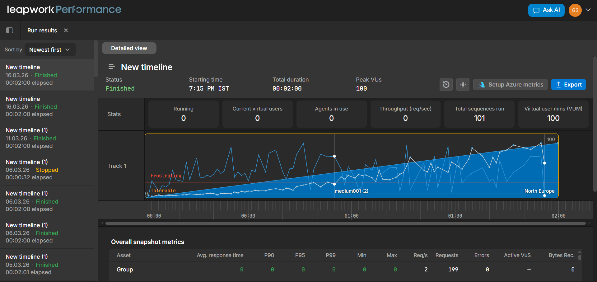
Run list
On the left side, the run list displays previously executed timelines. Each entry shows key information such as the timeline name, when the run started, its status, and how long it lasted.
This list helps you navigate between runs and compare results over time. For example, you might review how a recent run compares to an earlier one, or quickly check whether a run finished successfully or was stopped early.
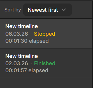
Each run typically includes:
-
Timeline name
-
Start date and time
-
Status (such as Finished or Stopped)
-
Duration
You can also sort the list (for example, by newest first) to find specific runs more easily.
Run header and summary
At the top of the workspace, the run header focuses on the selected run and provides a quick overview of its key details. It shows the timeline name, run status, start time, total duration, and peak virtual users.

Below this, summary tiles give you a snapshot of important metrics during the run. These include values such as:
-
Current virtual users
-
Throughput (requests per second)
-
Agents in use
-
Total sequences executed
-
Virtual user minutes (VUM)
Together, the header and tiles help you quickly understand the scale and outcome of the run before diving deeper.
Timeline and virtual user chart
The central chart shows how the run behaved over time. It combines load and performance data so you can see how the system responded as virtual users increased or decreased.
The chart typically shows:
-
Virtual user count as a filled area
-
Response time as a line
-
A time ruler across the bottom
It may also include visual indicators, such as experience bands, to highlight when response times move into less acceptable ranges.
As you move your cursor across the chart, the summary tiles update to reflect metrics at that exact point in time. This makes it easier to connect what you see visually with actual values like throughput and active users.
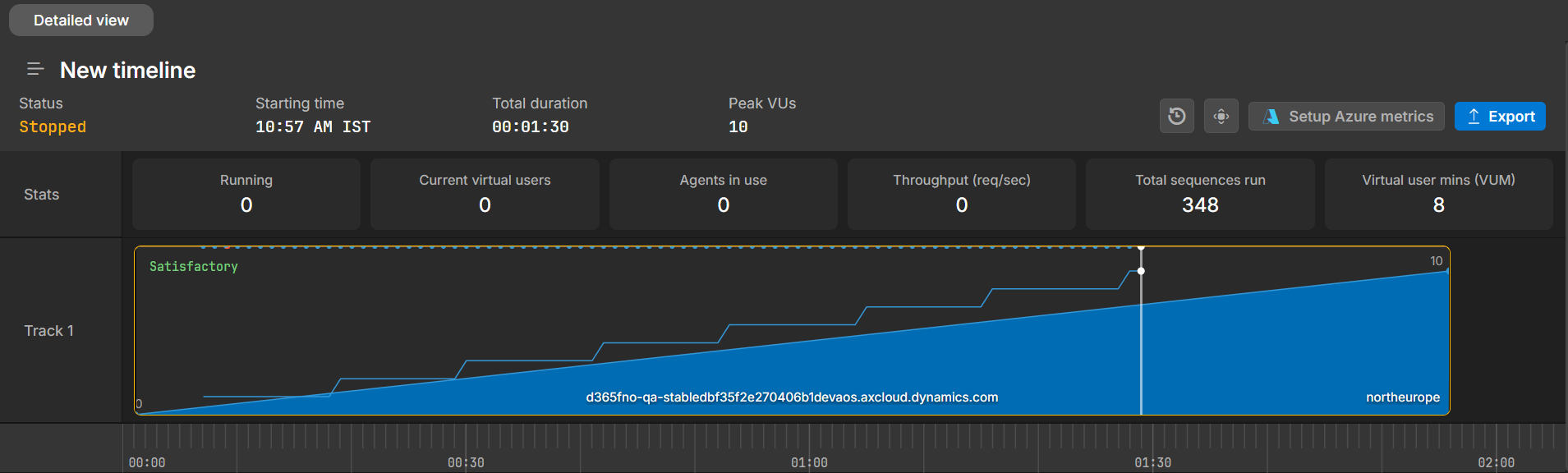
You can use this chart to confirm that the run followed the expected load pattern and to spot periods where performance changes or becomes unstable.
Overall snapshot metrics
Below the chart, the metrics table shows aggregated statistics for the run. Each row represents an asset from the timeline, such as a group of requests or a specific endpoint.
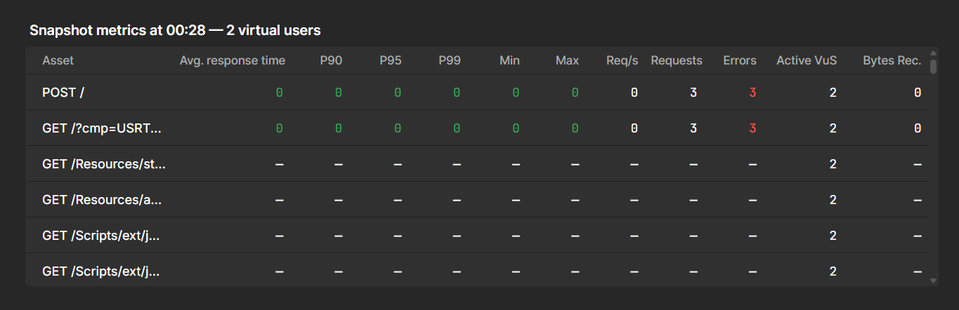
For each asset, the table includes metrics such as:
-
Average response time
-
Percentiles (P90, P95, P99)
-
Minimum and maximum response times
-
Requests per second and total requests
-
Error counts and data volume
This table helps you compare different parts of your system, identify slow or failing endpoints, and confirm that key transactions received enough traffic.
For each asset, the table shows:
|
Metric |
Description |
|---|---|
|
Avg. response time |
Average response time during the run. |
|
P90, P95, P99 |
Response‑time percentiles that indicate how fast most requests were. |
|
Min / Max |
The best and worst response times observed. |
|
Req/s |
Average number of requests per second for that asset. |
|
Requests |
Total number of requests sent. |
|
Errors |
Number of failed requests. |
|
Active VUs |
Number of virtual users associated with that asset (where applicable). |
|
Bytes Rec. |
Total bytes received for the asset. |
You can scroll through the table if there are many assets in the run.
Performance AI Insights
At the bottom of the Run results workspace, the Performance AI Insights panel summarises notable patterns in the run. When insights are available, this panel may highlight things like:
-
Sudden changes in response time or throughput.
-
Endpoints that behave significantly worse than others.
-
Anomalies that might deserve deeper analysis.
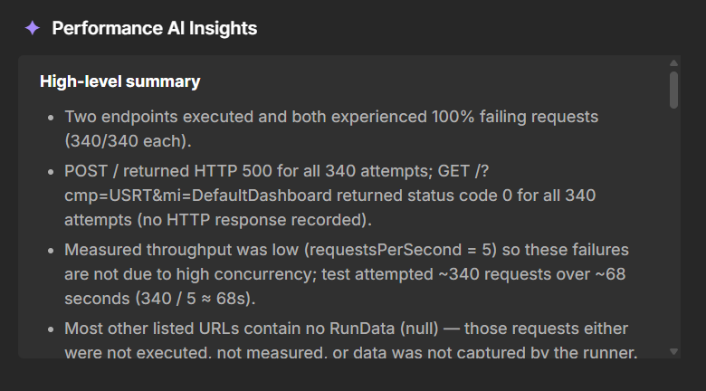
Use AI insights as a starting point for analysis. Combine them with what you see in the chart and metrics tables to decide which parts of your system need further investigation.
Run Results PDF/HTML Export
The Run results view now includes PDF and HTML as export options alongside the existing Excel export. After a timeline run completes, you can click the Export dropdown in the top-right corner of the results panel and choose your preferred format.
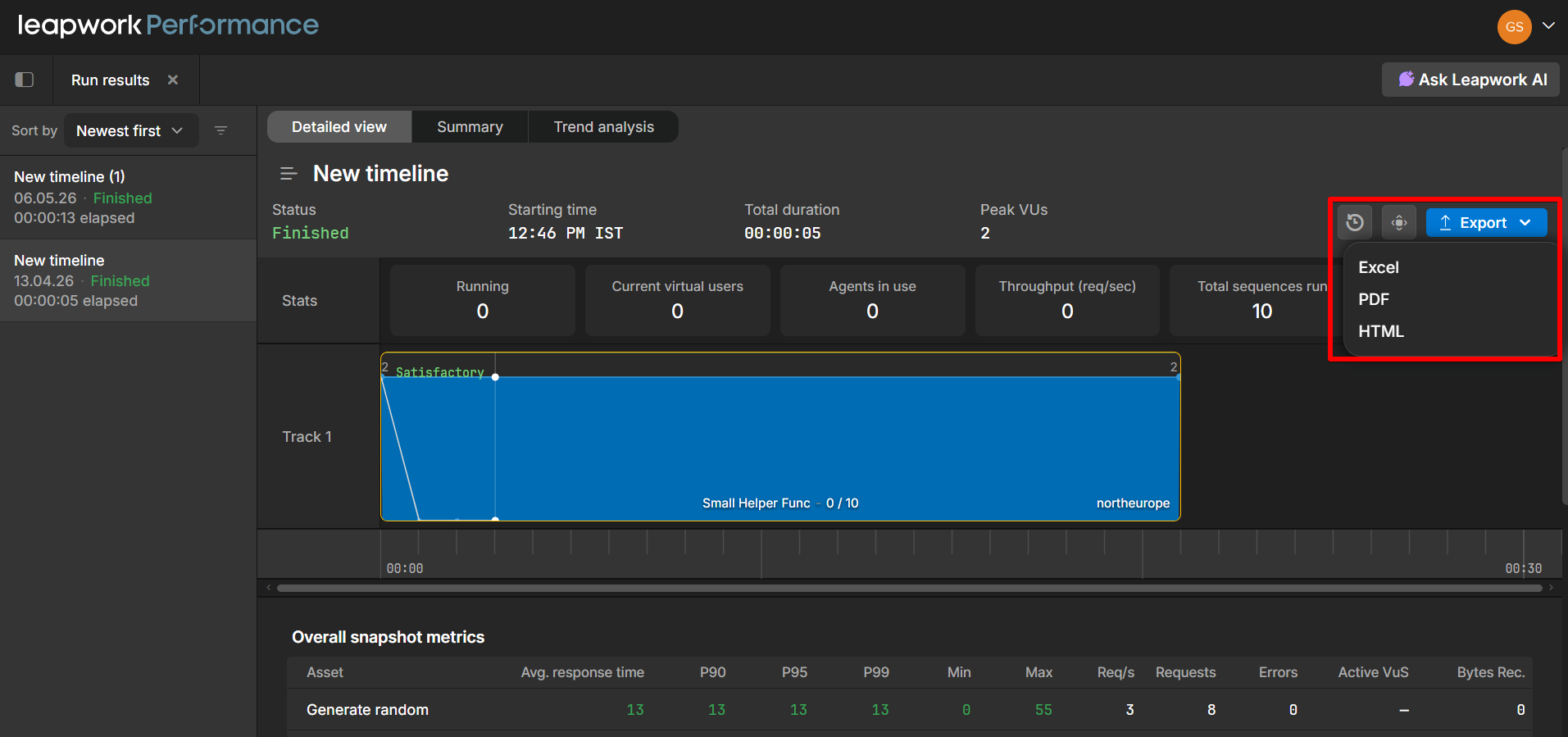
Available export formats:
-
Excel: Tabular data export
-
PDF: A formatted report suitable for sharing or archiving
-
HTML: A self-contained HTML report that can be opened in any browser
This is useful when you need to share performance run results with stakeholders who don't have access to Leapwork Performance, or when you want to archive results in a portable, readable format.
The exported report includes the run summary (status, starting time, total duration, peak VUs), stats, track visualizations, and overall snapshot metrics such as average response time, percentiles (P90, P95, P99), min/max, requests per second, and error counts.