The Collapse UI Element block is used in Desktop UI automation to collapse a UI element, such as a collapse/expand button or disclosure control, in an already open application window. When executed, the block locates the specified element and performs the collapse action on it.
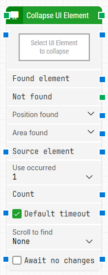
Fully expanded, the Collapse UI Element block shows the following properties:
Note: The screenshot on this page uses the Elegance Design, introduced in 2025.3. If you are using an earlier version, your layout may look different.
Quick-start
Drag Collapse UI Element onto the canvas.
Capture the target in Select UI Element (required) and optionally adjust parameters such as Source element, Use occurrence, Default timeout, Timeout, Scroll to find, Await no changes.
Run the flow when it’s ready.
For a minimal setup, set Select UI Element to the control you want to collapse and run the flow with the default settings.
Building block parameters
Parameters
Block header: Shows the current name of the Collapse UI Element block. You can rename it by double-clicking the header and typing a new title to keep flows readable and organized.
Select UI Element: Contains the locator for the UI element to be collapsed. This parameter must be set for the block to operate.
Click the field and choose Capture new element to capture the element.
Choose Edit element to modify an existing locator.
Right-click and select Clear element to remove it.
Found element: Contains the UI element that was found in the application window. You can use this as a source in other blocks to narrow searches to a specific region or element, such as a particular row or cell. If the element is not found, this property is empty.
Not found: Triggers if the UI element is not found within the time specified in Timeout. If nothing is connected to this output and the element is not found, the case ends with status Fail. You can use this output to branch the flow when the element cannot be located.
Position found: Returns the position of the UI element on the application canvas as X, Y coordinates, relative to the top-left corner of the screen (usually 0, 0).
In multi-screen setups, coordinates can be negative or exceed a single screen’s resolution depending on monitor placement. Elements that are not visible are reported at position 0, 0. You can expand this property to work with X and Y separately.
Area found: Returns the position and size of the found element as X, Y, Width, Height coordinates, relative to the top-left corner of the screen. The same multi-screen considerations apply as for Position found. Expanding this property allows you to use the position and size values individually.
Source element: Limits the search to a previously captured source element instead of searching the entire application window. For example, you can capture a table row in one block and then, by setting that row as Source element, collapse a specific control within that row.
Use occur.: Determines which occurrence of the matching UI element to collapse when more than one is found:
Specific index: collapse a specific occurrence (for example, the first or second match).
All: iterate through all occurrences. When All is selected, the sub-properties Current index and the Completed output become available, and the main execution path is triggered for each occurrence.
Current index: Indicates the index of the current occurrence when iterating through all matches. For example, if three matching elements are found, this property will be 1 for the first element, then 2, and finally 3 for the last one.
Completed: Triggers when iteration through all occurrences has finished while Use occur. = All.
Count: Contains the total number of UI elements found that match the locator defined in Select UI Element. This can be used for validation or decision-making later in the flow.
Default timeout: Controls how the timeout for this block is determined:
When the checkbox is not selected, the block uses a timeout of 10 seconds, unless you override it via Timeout.
When the checkbox is selected, the block uses the Default timeout value defined in the flow settings.
Timeout: Sets the maximum time the block spends searching for the UI element before giving up and triggering the Not found output. This timeout applies only to this block. Each case also has a separate global timeout configured in the Settings panel; if the case runs longer than that global timeout, it is cancelled regardless of this block’s timeout.
Scroll to find: Specifies whether scrolling should be used when searching for the UI element. When a value other than None is selected, the block scrolls through scrollable content while searching, which is helpful for lists or panels where elements may appear only after scrolling.
Await no changes: When selected, instructs the block to wait until there have been no visible changes on screen for the duration defined in Await Timeout before performing the collapse operation. This helps ensure that the UI has stabilized before the action is executed.
Await Timeout: Defines, in seconds, how long the screen must remain unchanged when Await no changes is enabled before the block proceeds to collapse the element.
Guidelines for understanding and using the Strategy Editor in Leapwork to define, refine, and validate robust locator strategies for UI elements using DOM structure, tokens, and wildcards.